The Upjohn Company, etc.
While these Design That Works pages will be mostly about my current work, I’m including a small sample of my work at The Upjohn Company in the 1970s and 80s. All of my professional life I’ve strived to do design that works, so it seems appropriate to include some of that historical work in this section. I’ll say a few words here about my professional design work and corporate career, and add more about that on my Philip Kunze personal pages one of these days.
 is the airport designator for Kalamazoo, Michigan. Kalamazoo was the home of The Upjohn Company for more than 100 years. It has been my home since I moved here to work for The Upjohn Company about 40 years ago. When I arrived, the company seemed almost apologetic for having shareholders, no longer being family-owned. Upjohn was a very good company to work for, and I enjoyed most of my career there. Sure, there were bumps along the way, but I made the most of the opportunities I had.
Opportunities included a career path. I worked on the creative support side of marketing part of my career. And I worked at the center of the marketing universe, having budget and management responsibilities, another part of my career. I worked in all promotional and educational media. I wrote and designed. I conceptualized and implemented. And did I mention the AIGA and STA awards that my projects received?
Opportunities also included resources. Inside the company, we had a treasure of talented people, from R&D to production, to marketing, and field sales. I learned a great deal from them. And I enjoyed the freedom to draw upon any creative resources, outside the company, as appropriate, that I needed to accomplish my work. We worked with medical thought leaders, government agencies, renowned medical illustrators, and leading designers, photographers, and advertising agencies. Quality was a company hallmark from top to bottom. And did I mention the company planes and adequate budgets?
Another opportunity was travel. As an art director, many of my resources were in Chicago and Detroit, affording frequent access to metropolitan areas. As a product manager, I spent a great deal of time in New York City with advertising and communication agencies. As worldwide exhibit manager, I was frequently on the road at medical meetings in the US east, west, and south (there weren’t many popular medical meeting destinations in the Midwest), and around the world (I attended some of the more than 75 US & WW major conventions per year). Working and learning in the field, and developing professional working relationships with field organizations became as valuable as working in my office. And did I mention the museums I was able to visit?
I realize that many of these opportunities are disappearing from corporate landscapes these days, along with job security, and feel fortunate to have had a career during the era I did. Perhaps the most valuable opportunity of my career was that of being able to leave “at the top of my game” with a great deal of knowledge and experience – as well as at the top of Upjohn’s game. I could see the writing on the wall in the early 90s. Following a succession of mergers, Upjohn is now an invisible (except to locals) part of Pfizer. But enough nostalgia.

My design responsibilities at Upjohn as a graphic designer and art director ranged from communication concept to press checks, and everything in between. We handled large volumes of work. Our work was highly detailed and regulated by the FDA. There was no room for error. A dosage decimal point in the wrong place could mean the difference between life and death. I spent hours on the phone calling in type changes. The work was often tedious, laborious, intensive – and rewarding in many ways.
I worked in all Upjohn product areas, in promotional and educational materials. Most of my work was in anti-inflammatory, cardiovascular, central nervous system, infectious disease, and metabolic product areas. Corporate and experimental medicine work also included agricultural, chemical, cancer, DNA research, and reproductive medicine.
Here then, is a brief look back at modernist information design during the era of the International Typographic Style, shortly after the beginning of our love affair with Helvetica. Rather than the usual “. . . and then I designed . . . and then I designed” approach, I’m presenting my work as related to typography, disease process, and medical illustration.
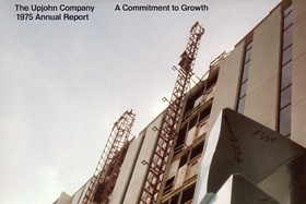
 But first, annual reports, always a choice project for designers back then. We inside art directors took turns, and I got more than my share, designing five in seven years. Will Burtin had been designing them for Upjohn (and setting the bar pretty high) before we brought them inside. Copy was written inside too, by public relations, and we worked very closely with them. Photo direction, grid systems, tight deadlines, and more. The samples to the right recall the reserved clarity of pharmaceutical information design in the 1970s.
 In the beginning was always the word. And there were always lots of words, lots of typography. Clean pages, legible, readable, white space, no distracting artifacts. Frequently, all we had to work with was type and a few tables. Sometimes a product photo. Diagrams and graphic forms were helpful in visualizing information and creating meaning. FDA regulations about type sizes, and relationships of generic names to brand names of prescription drugs posed challenges.
 Upjohn favored disease-concept selling, frequenting the need for us to visualize disease process.
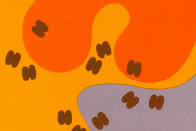
Oftentimes, we did this with graphic forms to focus a physician on a concept, without a lot of details.
Disease process, then set the stage for a conversation about drug mechanism of action, which we frequently used to distinguish our products from the competition.
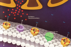
 Sometimes we did need to visualize a disease process in greater detail. During my design career, before the advent of today’s medical imaging technologies, we relied on the expertise of medical illustrators to visualize what we could not see. While we have many more imaging tools available today, illustrators continue to play important roles, interpreting what we can and cannot see. Here are a few examples of the value of the work of illustrators interpreting what cannot be seen, and creating meaning.
And the “etc.” part of this page includes other work along the way, Upjohn supported, and my own pro bono work, frequently among my most gratifying work. This work includes the Kalamazoo Junior Symphony Orchestra, Prep String Orchestra, Weavers Guild of Kalamazoo, Kalamazoo Foundation, Special Days Camps for children with cancer, and various others. I’ll post samples as I have time.


