
Class of 2014 Learning Typography
The Class of 2014 is beginning to learn about typography. In recent years I’ve documented students learning about design and typography on my Teaching Graphic Design page and on my Class of 2013 Learning Typography page. And I’ve posted password-protected class pages with after-class enrichment and resources for students. I’m now merging public and private online content on this public page for the Class of 2014. I invite you to follow along with the Class of 2014 through Typography I, Spring Semester 2012, at Western Michigan University.
On the first day of class we talked about the precision of words, and how that precision can be felt even in the type itself as we passed around a couple of characters of 72 point Clarendon condensed foundry type.

Students continued to get the “feel” of type as they arranged 528 point letterforms in an anagram kind of wordplay until they spelled Typography I. Students could identify variations – stroke weights, stress, x-heights, and the disappearance of serifs – in the letterform characteristics that trace the evolution of Roman typefaces from the blackletter gothic “T” to the humanist sans serif “y”. These 10 evolutionary steps span about 500 years, and during the next two weeks we’ll be studying why these steps occurred when and where they did.

But first, it’s class picture time, a tradition I’ve established for the second class of the semester. Students began learning how various typefaces can express meaning by designing nametags in hand-drawn typefaces that communicate something about themselves. Please meet the Graphic Design Class of 2014!

During the second week of the semester we began a deep dive into the evolution of the Roman alphabet, the evolution of writing, the evolution of Roman typefaces, and the proliferation of Roman typefaces. This journey from the cradle of civilization through the past 500 years of typeface development spans about 5000 years. Students were assigned topics to study in the areas of history, culture, arts, humanities, technology, and letterform evolution during those 5000 years. They worked individually and collaboratively in four time-period groups.

We use two textbooks for all three courses in our typography sequence: Typographic Design: Form and Communication by Rob Carter, Ben Day, and Philip Meggs; and Thinking with Type by Ellen Lupton. These textbooks include original specimens from the time periods we’re studying. Also, our Design Center library and the WMU Libraries Special Collections are invaluable resources for our studies. There are of course, many online resources. Stephan Saaltink, a visiting scholar in the Gwen Frostic School of Art, suggested downloads of the two volumes of D. B. Updike’s Printing Types describing the evolution of typefaces from Gutenberg through the early 20th century:
http://www.archive.org/details/printingtypesthe01updi
http://www.archive.org/details/printingtypesth00updigoog
We continued studying the “who, what, when, where, why, and how” of typeface evolution during the next week. Students arrive in Typography I with varying backgrounds in the humanities, so we need to survey at least some history as a foundation for our typography studies. Two weeks isn’t much time, of course, to cover 5000 years of cultural contexts and the evolution of letterforms (Judson Laipply’s “Evolution of Dance” comes to mind).
At the end of the first week we had a working crit for students to share what they’d learned about their topics. And at the end of the second week students arrayed their work on the board longitudinally by time, and cross-sectionally by topic. For example, the group studying the evolution of writing from the Roman Empire to Gutenberg presented: a historical overview describing the administrative and literate needs for writing and included a timeline chronicling the Republic and Empire through the power shift to the east; a map visualizing the where and why of writing in science and religion during the first millennium; how technology and inventions played a role in the evolution of writing; and described and illustrated the evolution of writing from Roman capitals to gothic blackletter. Similarly, each of the groups studying the other three time periods presented the evolution of the Roman alphabet beginning in the Fertile Crescent or the cradle of civilization, the evolution of Roman typefaces beginning during the Renaissance, and the proliferation of Roman typefaces beginning during the Industrial Revolution. Thus, we could trace the beginnings of mark making in Sumer more than 5000 years ago to the present, and we could see how history, culture, and technology shaped the letterforms of each of the four evolutionary time periods – through a kaleidoscope of descriptions, timelines, maps, images, and evolutionary specimens.

It is sometimes difficult to grasp the nuances of how a technology or movement affected the evolution of letterforms centuries ago, but it is easy to see these changes today as type migrates from paper to screen. While it’s difficult to imagine, I suggested that the evolution of communication during the careers of the Class of 2014 will be of the magnitude of the last time period we discussed – the span of the 19th and 20th centuries. Think about Moore’s law and other theories of accelerating change and accelerating returns. We took a few minutes to consider how exponentially increasing rates of change will affect typographic form, and indeed, their work lives.
This coming week, we travel back to the past again to study the vocabulary of typography. Most of the typesetting terminology we use today has its roots in the era of metal type, so a good place to begin studying vocabulary is among cases of metal type – at Kalamazoo Book Arts Center (KBAC). Stay tuned………
(Note to students: We’ll continue discussing vocabulary at KBAC Thursday, so no need to bring laptops, but you should bring your vocabulary pages to submit if you have not already done so. And those who have not yet emailed vocabulary PDFs to me, please do so.)
Four weeks into the semester now, and it’s time for some vocabulary. Our typography vocabulary (related to the form characteristics of type and to the physical properties of type) has evolved over about 500 years since the invention of movable type. Each generation of technology layered new terminology over old.
During the first 400 years or so of movable type, the principal markets for typesetters and printers were arguably related to the book publishing industry. Thus, the Kalamazoo Book Arts Center is the perfect setting to feel (literally and figuratively) history and trace our typography vocabulary back over the centuries. The Kalamazoo Book Arts Center is located in the Park Trades Center in downtown Kalamazoo, and is the leading book arts center in our region.

We met there for two classes this past week. Jeff Abshear, a Fulbright Research Scholar who has studied Italian printing, bookbinding, and papermaking in Venice, is the founding director of KBAC. Jeff introduced us to book arts, papermaking, handset type, letterpress printing, and bookbinding, and told us about some of the current KBAC projects. We toured the newly-opened gift shop and expanded work space. Jeff explained how type is set by hand in a composing stick, locked into a chase, proofed, and printed – as it had been for centuries before the advent of typesetting machines, photo type, and digital type.

Then we gathered around a group of tables to talk about vocabulary. Students had been assigned vocabulary terms to research, define, and share with one another. We discussed glyphs, serifs, small caps, ascenders, kerning, base line, x-height, etc. (that relate to the evolutionary form characteristics of type). And we discussed points, picas, leading, measures, etc. (that relate to the physical properties of type). Type form, physicality, and history come together in creating meaning with words. That’s why we’ve taken the first four weeks of the semester to explore the relationships among them.
And because it’s important for designers/typesetters today to know how to control typographic (form and physical) variables, students described InDesign menus and tools for working with these characteristics and properties of type. For example, how do you adjust kerning, and what does 8/10 mean? The language is the same as it’s been for more than a century, but the ways that we adjust letter spacing and line spacing have changed with the technologies.

During our visit to KBAC someone noticed that almost everyone in class was wearing plaids (did you notice that in the photos?) – so here you have the plaid Class of 2014!

(Note to students: Remember to bring the letterform sketches that you’re working on to class Tuesday. I’m not looking for finished compositions – we’ll get to that next week – rather, you should be developing pages of sketches. You should be focusing on the form characteristics that distinguish your assigned evolutionary period of writing or typeface, per our discussion last Thursday. You should then annotate those characteristics on your sketches. Please send me a Hey Phil if you have any questions.)
The assigned vocabulary terms ranged from early writing systems to hot type, photo type, and digital type, spanning 5000 years. It is useful for designers to know when, where, and how the design and typesetting vocabulary we use today evolved along that long timeline. Elements of early writing systems, pictographs, and ideographs, among the earliest forms of mark making, are still evident in logotypes and symbol systems we design today. Glyphs, ligatures, and serifs that date to the earliest forms of our Roman alphabet are terms that are still in use today in InDesign palettes and menus. Stroke, contrast, stress, descenders, drop caps, and miniscules have their origins in more than a thousand years of handwriting before the advent of moveable type. With the advent of moveable type, uppercase and lowercase became part of our vocabulary. Body and font sizes, oldstyle figures, points and picas date to early days of metal typesetting. We learned that 8/10 means 8 point type on 2 points of leading (or line space), for a total of 10 points baseline to baseline. We learned that the archaic term “measure” means line length. Vocabulary terms for type styles, Frutiger’s grid, and font formats, such as OpenType that we now use, evolved to meet the needs of advancing technologies during the past couple of centuries. We could only scratch the surface, of course – so little time, so much to learn! Here is a sample (below) of how some students visualized what they learned.

As we wrapped up our vocabulary work, we shifted our focus to letterforms themselves. With Valentine’s Day approaching, we took time out for an appropriate letterform composition. Here is a sampler of Valentine wishes we pinned up on the board on February 14th 2012………….

As one student’s dictionary definition described, the Valentines were amatory, sentimental, satirical, and comical, but most importantly, they were compositions of letterforms.
In a more serious vein of letterform compositions, our next assignment focuses on the distinguishing characteristics of typefaces classified in specific historical/traditional groupings. These classifications evolved in the late 1800s as typefaces proliferated during the Industrial Revolution. They are relevant touchstones today with the explosion of digital crossover typefaces during the past couple of decades. The 148 Adobe OpenType faces that students were given at the beginning of the semester are classified (by Adobe and others) into 14 historical/traditional groupings. Students wrangled all of the fonts (almost 1000) into Font Book (font management software that comes with Mac OS X) folders to work with during the rest of the semester.
In keeping with our historical perspective, this assignment includes “pre-writing” mark making (beginning in the Cradle of Civilization) and “pre-Gutenberg” typefaces (during the evolution of writing) in addition to typefaces we commonly use today. Thus, in 20 assigned steps we span five millennia in the evolution of our Roman alphabet and the typefaces we use today.
Students began by sketching their assigned letterforms that are representative of specific time periods, and annotating distinguishing characteristics. Then students drilled deeper, studying how their assigned letterforms are different from and similar to other typefaces in their time periods and/or adjacent time periods. By the end of the second week students pinned up preliminary compositions for a working crit.

(Note to students: We’ll pin up 10½” square letterform compositions at 10 Tuesday morning. I’ll be happy to comment on work in progress this weekend if you email me a PDF. We’ll work on these compositions in class Tuesday, and I’ll review specs for final submission on Thursday. Those of you who have vocabulary revisions per our conversations in class Thursday should submit PDF and paper copies Tuesday. I’ll meet with the last few students about revisions on Tuesday.)
We pinned up letterform compositions one more time before final submission – this time, in historical chronological sequence, so we could see how mark making in early civilizations evolved into our Roman alphabet and manuscript writing forms, and then into typefaces during the past 500 years. We could see the evolutionary steps, and could also identify some of the form variations within traditional/historical classifications. For example, it was apparent how caroline miniscules evolved into gothic blackletter writing, and then into type, in two expressive compositions. And it was easy to see how modern typefaces evolved into slab serifs, and to compare bracketed and unbracketed serifs dynamically side by side in both historical classifications. And it was easy to see in an elegant composition of “c” letterforms how subtle variations in stroke contrast and stroke termination distinguish four neo-grotesque typefaces from one another. Well, I could go on, but you get the idea. I expect that the class is getting it by now too.

Students mounted final compositions for submission and pinned them up again at the beginning of the next class. Figure/ground relationships are important in considering whether to mount on black, white, or gray. Notice below, for example, the difference between how white letterforms on black fields stand out on black mats compared with white mats. And how white, black, and gray letterforms on white or gray fields stand out on black, white, or gray mats. The choice of mat color modulates figure/ground relationships within the composition.
We arrayed the letterform compositions chronologically on the board in two rows, with pre-Gutenberg (mark making and writing) along the top row, and post-Gutenberg (typefaces we’re familiar with today) along the bottom row.

The final letterform compositions are shown below (with apologies to students for juxtapositions without mats in order to better visualize adjacent type forms on the site).
The first four (pre-Gutenberg) rows show: three steps in the evolution or our Roman alphabet from mark making in the Cradle of Civilization to Phoenicia; four steps in the evolution of letterforms from Greece to Rome, and how writing with Roman capital letters evolved from glyphic forms; two steps in the evolution of minuscule (or half-uncial) letterforms during Roman Empire; and two steps in the evolution of caroline miniscule and gothic writing into gothic or blackletter type (think gothic architecture). Manuscript writing in northern Europe during the middle ages culminated in a blackletter script known as textura, and was the basis for Gutenberg’s first types used in his 42-line Bible. In these first four rows we travel 4500 years from the beginning of communicating with marks to a highly developed system of writing phonetic letterforms.

The second four (post-Gutenberg) rows show: three steps in the evolution of oldstyle typefaces (from the blackletter script known as rotunda in southern Europe) beginning in Italy during the Renaissance to transitional typefaces in northern Europe; two steps in the evolution of modern to slab serif typefaces during and after the Industrial Revolution in Europe and the US; two steps in the evolution of grotesque to neo-grotesque typefaces during the twentieth century; and the culmination of that evolution into geometric typefaces, followed by the reactionary interest in humanist sans serif typefaces, in the bottom row. In these second four rows we travel 500 years from the beginning of moveable type to the advent of digital type.
For those seeking more information on these evolutionary steps in the context of graphic design history, here is a succinct overview: http://designhistory.org/
With these letterform compositions pinned up on the board, we began talking about the next assignment…………
(Note to students: Remember to bring to class Tuesday two examples of typographic logos clipped from magazines, one that works and one that doesn’t work. Also bring in your ideas for a logo for America’s Favorite Pastime along with thoughts on typefaces.)
The next assignment is designing a typographic logo for “America’s Favorite Pastime” – and students get to decide what it is. The class had a lot of good ideas that they’re beginning to work on. But first……..
We began by talking about how logos fit into the four Ps of the marketing mix (and where graphic designers fit into the marketing mix). We touched briefly on identity programs, branding and rebranding, anti-branding and culture jamming, consumerism, and anti-consumerism – topics that graphic design students will encounter in school and in their professional lives. I expect that the pastimes students select or invent, and the logos they design for them, will in various ways reflect some of these considerations because I asked students to think about whether their design would represent a positive, neutral, or negative point of view about the activity.
As a point of departure in this quest, I asked students to bring in examples of logos that, in their opinion, work (hall of fame) and don’t work (hall of shame). We pinned them up, talked about the appropriateness of classifications, and guessed what some of those we didn’t recognize could mean. As you might imagine, there were some agreements and disagreements. The important point, though, was that the same considerations we discussed will apply to logos they’ll be designing.

The evening before class, Bryan had emailed to suggest we celebrate National Pancake Day at IHOP for breakfast. I agreed and Bryan quickly rallied class support, so following our critical look at logos, we headed over to IHOP to continue our discussion. And another class picture. The next assignment was off to a good start on full stomachs!

(Note to students: Please remember to bring to class Thursday all work to date for review before spring break!)
The last class before spring break was an important one because it marked the beginning of real-world design problem solving by applying what students learned about letterforms during the first half of the semester. Students arrayed their work over 30 feet of tables creating a 5000 year timeline visualizing the origins of the alphabet, the evolution of writing, and the evolution of typesetting in order to see historical contexts juxtaposed with modern type forms and vocabulary. I asked students to place their Valentines along the historical continuum. And those who brought in their nametags from the first week of the semester also positioned them along the timeline. Valentines and nametags skewed toward the more modern typefaces.
With this body of work in front of us, we talked about connecting the dots. We talked about the current assignment and the rest of the semester. We talked about creating meaning with type. We talked about how letterform characteristics could contribute to branding and to communicating the nature of the pastime they’re developing a logo for. I asked if any of the type forms on the table might suggest any of their pastimes – driving, texting, talking, playing ultimate Frisbee, shopping, consuming, etc. What typefaces do you see from behind the wheel of a car or on your phone, what typefaces do you use for talking or playing Frisbee, what typefaces help you shop ‘til you drop or spend ‘til the end? Why?
We talked about how the history, type forms, and vocabulary students learned during the first half of the semester, and current work on America’s Favorite Pastime, are all building blocks for the final capstone assignment.

In preparation for that assignment, I introduced the subject of typeface taxonomies and showed students how the type specimens composed by the Class of 2013 will be useful in considering and comparing typefaces for the final assignment (and later in Type II). Taxonomies are ways of classifying things according to schemes. Typefaces are classified by alphabetical schemes in applications like Word and InDesign. With hundreds or thousands of typefaces on their computers, graphic designers find that an alphabetical scheme is cumbersome to use. Graphic designers prefer to think about classifying typefaces according to form characteristics. Historical classifications have been useful for doing that for more than a hundred years. However, the proliferation of hybrid typeface form characteristics these days suggests that other classification schemes may be useful. Other schemes might be called folksonomies or tagging systems. In order to facilitate the use of other schemes, the Class of 2013 type specimens are composed on individual pages for the flexibility of loose-leaf binding. Presently, these pages will help students compare typefaces for the current assignment. We’ll return to the use of taxonomies and folksonomies in the next assignment………
The type specimen binder you see in the foreground below happens to be turned to a page of Janson. You might be able to read “Hamburgefons” (the keyword or test word we use to compare typefaces) on the right-hand page. Nearby you see: compositions of letterforms spanning the 1500s, 1600s, and 1700s; Bryan’s description of letterform evolution from 1450 to 1775; Aaron’s nametag drawn in a transitional typeface; Elliot’s description of early type founding terms; and Allie’s descriptions of terms to measure type dating to early type founding. Fast forward a couple of hundred years to the right end of the timeline, and we find Ashley’s nametag and her Valentine, and Tyler’s and Ronnie’s Valentines all in sans serif typefaces appropriately situated among descriptions of machine typesetting and compositions of twentieth century letterforms. All of these juxtapositions along the timeline are connected by time and place. The relationships among them are meaningful. Most of the students in the class had little or no exposure to graphic design before entering the program last fall, so it takes a while to grasp these connections. During the second half of the semester students will have opportunities to connect these building blocks as they explore design solutions in complex compositions of words and sentences – stay tuned.

I asked students to think critically about typefaces in the wild over spring break.
(Note to students: Be safe, have fun, and recharge your batteries! The pastime assignment is about more than finding an expressive typeface by trying your pastime in a number of different typefaces. It is about making a composition of letterforms that expresses the essence of your pastime. The assignment is about more than finding a place to tuck in the tagline. It is about making the tagline an integral part of the composition and the meaning. Read the assignment again, especially noting the paragraph about sketching names and typefaces on paper. Think, sketch, think, sketch………)
After spring break students pinned up work in progress on “America’s Favorite Pastime” to discuss. Ideas ranged widely, from fun to serious to sports to social commentary. And points of view were evident in students’ designs. You’ll see some of the usual suspects below, and maybe there will be some surprises when I post finished designs.

(Note to students: “America’s Favorite Pastime” will be due in class at 10:00 Thursday, on paper and PDF. Read the assignment again, especially about submission requirements. At this point you should be making micro adjustments to figure/ground relationships. Remember to use your InDesign kerning and tracking tools prudently. I’ll introduce the next assignment Thursday.)
Students worked intensely during the last two hours before submitting their logo designs for “America’s Favorite Pastime”. We talked mostly about kerning, tracking, and other micro figure/ground adjustments. In some cases we talked about whether the tagline should be in all caps (creating a line of type with dominant horizontal top and bottom edges) or cap and lower (creating a line of type with a dominant bottom edge and a feathered top edge resulting from type forms extending above the x-height). We talked about tagline typeface choices and type alignments.
By the end of class, 20 designs were submitted. I thought it might be interesting to look at the logos grouped somewhat categorically (even though they all don’t fall neatly into activity categories).
I’ll call one group social commentary. These logos attract, engage, and communicate something about facets of American culture.

Another group might be called interactions with screens, ranging from active to passive.

And of course, we have sports activities.

And then, activities that don’t fit into the other categories. In general, these seem to express positive points of view about the activities. If not, some could have been classified with social commentary. This relates back to expressing meaning with type and words.

Were there any surprises from Tuesday to Thursday? Well, “unprotected sex” became “sex”. A change in college student behavior? A repositioning of point of view from social commentary to activity? Or a better idea for a design solution? Students made decisions like that for each of the pastime design solutions.
These are some of the ways that we’ve explored creating meaning with words and typographic compositions. They work in many different ways to express the typographic essence of activities that could be considered “America’s Favorite Pastime”. These explorations are important building blocks for our next assignment that takes us to the end of the semester – creating meaning with words and sentences.
(Note to students: Our class next Tuesday will begin at Bravo! Restaurant and Café at 8:45. As I emphasized in class, this should be a great launch for the capstone assignment, and an invaluable opportunity for input. Bring questions that come to mind while you’re writing your brief for the assignment.)
“A place to eat” is our capstone assignment for the semester. The centerpiece of this assignment is a menu design for a place to eat. Just as a menu is the foundation of a restaurant – the document that drives everything about the restaurant – the menu is the core of this assignment. Students will first invent a restaurant or identify one for a makeover. Then they’ll write a brief, describing their place to eat, the scope of their work (including a menu design and collateral material), and outline their design process. All students will design menus (the primary focus of this assignment). And in addition to menus, students will design other support materials as appropriate for their place to eat – ranging from business systems to signage to Web sites to T-shirts – whatever it takes to demonstrate their understanding of what they’ve learned in this first typography course.
Thus, this assignment affords students a variety of opportunities to create meaning with words and sentences. The assignment also introduces students to practical thinking about ways that the marketing mix applies to their design work. The traditional “four Ps” (price, product, promotion, and place) all come together in a menu. (More about all of that as we progress through the assignment.)
I introduced the assignment at the end of our last class, and launched it today at Bravo! Restaurant & Café here in Kalamazoo. Terry Hagen, one of the Bravo! co-owners, hosted a mini-charrette for our class. (Terry comes to us by way of the Culinary Institute of America, four-star restaurants in New York and elsewhere, and has been a restaurateur in Kalamazoo for three decades, successfully creating and sustaining two restaurants here from the ground up.) Terry described the real world of restaurant menu writing, identity, branding, target marketing, promotion, and whatever else students wanted to know about for this assignment. He illustrated points about the power of words and the economics of restaurant business simply with three bowls of tomato soup. Points well taken. Thank you Terry!

As we were leaving, students asked for yet another class picture. Note no snow on the ground now, trees leafing out, and students in shorts since the last class picture. So here once again, you have the Class of 2014 with full stomachs and full of ideas!

(Note to students: Bring your project briefs to class Thursday, and be prepared to discuss them at 8:00.)
Students brought lots of restaurant ideas to class Thursday. As you might imagine, students are proposing some number of cafes and bar-and-grill type restaurants, hangouts, and some specifically targeting college students with some interesting spins. Some students are proposing restaurants reflecting places they’ve been, favorite restaurants, ethnicities, interests, and experiences. Some of the restaurants are set in students’ home towns, some in Kalamazoo, and some unspecified. One is attempting to escape dull and boring, and another is flying high in the sky. Branding ideas are beginning to emerge. One restaurant idea is already a new college franchise. Some are makeovers and some are invented. Menu media range from print to iPad. Students discussed their briefs with one another, and began developing their ideas.

And this was a big week for the graduating seniors, the Class of 2012 – the opening of their Senior BFA Graphic Design Exhibition in our student gallery. I first met this class two years ago in Typography I in their first year in the graphic design program. From the beginning, they’ve been an exceptionally interactive and talented class of students. Senior exhibitions are magical moments for me because of the growth, maturity, and transformations that occur between the first and third years in the program. The opening reception was a great celebration of excellent work! I enjoyed meeting your families, and I wish you all the best!

Now back to the future and the Class of 2014, stay tuned……….
(Note to students: As I emphasized in class, the point of departure in this assignment will be the menu – it will drive all design work, as it drives everything in the restaurant business. So before you think about logos, colors, and typefaces – draft your menu copy. Remember to bring to class next Tuesday a half-dozen or so menu item descriptions to work with. Your project briefs are super; I’m excited, and looking forward to the next few weeks!)
Now that students have written briefs outlining their projects and are beginning to compile menu items, we talked about design process and workflow in class today. We talked about research, defining parameters of a design problem, information gathering, collaboration, iterative ideation process, mind mapping, experience mapping, creating menu content, and how to flow it into InDesign. With 20 students and 20 different projects being developed in class, there will be 20 different design processes. Students are now working with their menu items in the contexts of their briefs. They’re developing typographic concepts for their restaurants. Next we’ll move on to identity.
(Note to students: Remember that we’ll begin pinning up briefs, menu items, and concepts – logo ideas, color schemes, type specimens, menu sketches and dummies, etc. – whatever direction you’re working, and in whatever form at 8:00 Thursday morning.)
We discussed design process and workflow again in class Thursday with some more examples. We discussed the elements of an identity program that might be applicable to their restaurants, and how they might differ from branding America’s Favorite Pastime. We also discussed digital asset management, as it relates to everything from file structure on one’s own computer, to clients’ brand and enterprise asset management, to photo IPTC metadata standards. These are all important topics that design students should at least be familiar with.
Students pinned up restaurant identity concepts including briefs, menu items, and whatever they were working on – including notes, sketches, logos, type samples, existing menus for makeovers, etc. – we have some engaging restaurant names, good starts, and a long way to go.

(Note to students: We’ll begin class Tuesday looking specifically at logo designs. This means that you’ll need to firm up your restaurant name and tagline if applicable. And remember the added requirement of determining an available dotcom address to include on your menu – not necessarily only the restaurant name, but a site name that works for your purposes. Think about how it relates to the nature of your restaurant. This coming week we’ll be discussing information hierarchy, typographic grids, and alignments as related to menus.)
This week we worked on logo designs – quite a few of them are almost good to go. Students discovered it’s a lot easier to brand a restaurant with a graphic form (symbol, icon, or graphic representation of the nature of the restaurant) than it is with type. This is a typography class, though, so we’re focusing on creating meaning with typographic form. Students are integrating taglines and dotcoms into restaurant identities.
I emphasized structuring menu pages with typographic grids in the context of information hierarchy, and talked about type alignments. I asked how many different alignments could be used together on a page. One student answered conservatively: two. That would have been a very good answer back in the day. But if one carefully considers the hard and soft edges of blocks of type, there are myriad possibilities for integrating various combinations of alignments on a page. These are some of the considerations we discussed related to designing menus and collateral material.
Zachary, one of our graduating seniors (and an alum of my Type I and Type II classes), visited our class this week. I invited him to talk about his BFA thesis project. He is fielding a research project entitled “Typeface and the Connotative Interpretation of Textual Information.” He is conducting an online survey until 15 April 2012. It takes only a few minutes to complete, and I’m sure he’d appreciate your participation:
He is investigating how typeface choices affect the interpretation of textual information. He told us his findings to date look promising – that he is identifying patterns of relationships among typefaces and interpretations of text. I expect that he’ll publish his findings, and I’ll post a link on this page if I have one by the end of the semester.

The relationships that Zachary is investigating are relevant at this stage of our project because students are now considering typeface choices for menu text type. What might typefaces connote about a specific restaurant?
(Note to students: Logo designs and uses of taglines and dotcoms should be finalized in class Tuesday. We’ll talk more in class about menu copy and design, with the goal of substantially-complete menu designs this week.)
Students worked on restaurant logos and menu designs all week. We talked about information hierarchy, typographic grids, alignments, text frames, avoiding distracting visual artifacts on a page, readability, etc. At this stage of their menu compositions, students are focusing on text typefaces, sizes, styles, heads and subheads, where to put menu item prices, menu pagination, and other typographic variables – a lot to consider.
As we near the end of the semester, this was a busy week in the School of Art. Students were recognized for outstanding achievements at the annual Student Award Ceremony – many of the award recipients were graphic design students, including Lindsey and Michael (Class of 2012), our type techs last year. Award recipients in our Type I class were Aaron, John-Mark, and Steve (Class of 2014), and our type tech this year, Crystal (Class of 2013). The ceremony was followed by a reception for the 2012 Student Exhibition. As usual, many graphic design pieces were selected for the juried show, including works by Monica and Bryan in our class. And then the School of Art hosted the annual Open House that evening. Student design work lined the walls in our area, and our class displayed letterform compositions. What an afternoon and evening of celebrating student accomplishments! Congratulations and best wishes to all!

Now, back to the classroom………
A few paragraphs above, I described how the capstone assignment, “A place to eat”, incorporates many of the building blocks of the semester: letterform compositions, figure/ground relationships, typeface selection, type sizes, weights, and styles, letter and word spacing, and other typographic variables. In the samples below, you’ll see how various building blocks work together to create meaning with words and sentences.
This capstone assignment also introduced topics that students will be encountering during the next two years in our graphic design program: identity, branding (and rebranding), marketing mix, design process, workflow, systems design, information hierarchy, typographic grids, page structure, type alignments, etc. You’ll see below how this assignment afforded opportunities to explore these topics, and how the core component of this assignment, a menu, drives everything about a restaurant.
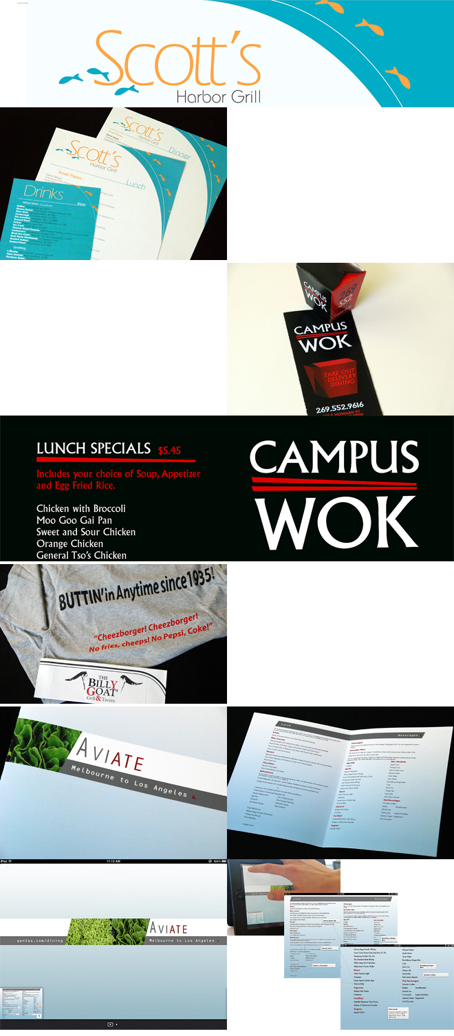
For the most part, students followed the briefs they wrote at the outset of the assignment. Some students worked with type only, and some incorporated graphic forms to reinforce identities and information hierarchy. Collateral material ranged widely from business systems to T-shirts. It’s not practical to show this entire body of student work, so I’ve selected a sample or two of each student’s work to demonstrate the typographic variables we worked with this semester, and a variety of possibilities for creating meaning with type. Consider how design and typeface choices set expectations for dining experiences.
Four students tackled makeovers – for repositioning brands, improving design/communication, and exploring media options. These are restaurants that students were familiar with, in Traverse City, Kalamazoo, Chicago, and somewhere between Melbourne and Los Angeles. Students described rationales for needed improvements in their briefs at the beginning of the assignment. A makeover is a delicate balance between a client’s perceptions of brand equity and a designer’s aesthetic of workability. I challenged each of these students to defend choices along this continuum. In the end, each design was successful in its own right. Representative of the challenges graphic designers face today is the Quantas Aviate menu, repurposing content from print to screen (in this case an iPad), adding layers of information (as you may be able to see in the screenshots below). Students considered how the name of a restaurant expresses the essence of its offerings, and how tag lines can reinforce identity.

Seven students invented new entries in the popular bar/grill/tavern category. Inspirations appear to have been drawn from the International Typographic Style, SNL, and letterform characteristics that just seemed to fit an idea. Notice how letterform characteristics suggest the nature of a restaurant in this category – ranging from modern to quaint/quirky. Notice how carefully-considered type alignments work – for example, DATASTE successfully incorporates centered, left, and staggered alignments, along with color, to structure compositions.

Four students invented cafés or specialty restaurants, three of which included performance and art spaces. The designs and typeface choices in this category seemed to favor the use of a fewer number of different typefaces, and more subtle and understated figure/ground relationships – for example, consider how sensitively the Venue creates an entire identity scheme with one typeface, modulations of typographic space, and variations in type size, weight, case, value, and alignments.

Five students invented ethnic or eccentric restaurants. Consider how typographic variables and graphic forms are used to expresses the essence of offerings of Indian/American, Mexican, and Japanese restaurants – and restaurants that offer a side of bacon and snake wine.

You may recognize some of these restaurant identities in the early sketches (several paragraphs above) that students pinned up weeks earlier. Some students had established identities early-on, and some evolved over time as they worked through various components of their designs. This is design process.
Menus are challenging to design. You’ll notice the complexity of information hierarchy in menus in all of the work shown. Not until you go about designing a menu do you think about how to identify and group categories, subcategories, and items, how to separate the name of a dish from its description, where to put prices, etc.
A requirement of this assignment was to submit final menu designs as comprehensive layouts (we used to call them comps) with the look and feel of a real menu. You might be able to see how well students accomplished this in some of the photos above. Some students also “comped-up” other components of system designs, including employee uniforms, a business system, carryout container, T-shirts and other merchandise, and even a working iPad menu.
I’m pleased with the success of this assignment overall. Some aspects of this assignment (like information hierarchy, typographic grids, paragraphing, tracking, and type coloration and texture) are typically taught in the Typography II course. Hopefully, this introduction to advanced topics will create awareness, stimulate thinking over the summer, and foster readiness for the next typography course in the fall.
Students laid out their final assignments on the tables in the center of the classroom on finals day, and we savored the moment. The designs in front of us represented a lot of hard work and a great deal of learning about type.

Students elected to have their final written exam during finals week. Thus, the semester ended quietly, as students described the difference between kerning and tracking, and explained once again what 8/10 means in a type specification, and then headed off for the summer one by one as they finished the final…………
